


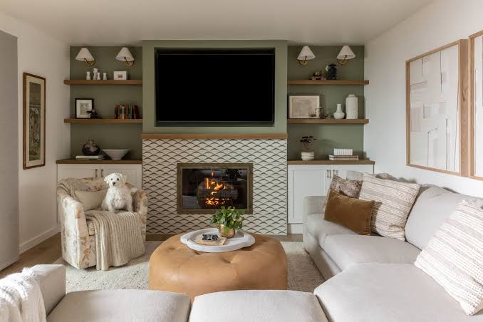
Combining neutral and bold colors is a simple way to create a home that feels stylish, balanced, and full of personality. Neutral shades such as white, beige, gray, cream, and taupe provide a calm foundation, while bold colors add energy and visual interest.
The key is finding the right balance so that strong colors enhance your space without overwhelming it.
Start With a Neutral Foundation
Begin with neutral colors for larger elements such as walls, sofas, flooring, and curtains. These shades create a flexible background that allows bolder colors to stand out.
For example, a cream-colored living room can provide the perfect foundation for adding deep green cushions, blue artwork, or terracotta accessories.
Choose One Main Bold Color
Instead of using several strong colors at once, choose one main bold shade. This makes the room feel more coordinated and prevents the colors from competing with each other.
Deep blue, emerald green, mustard yellow, terracotta, and rich burgundy can all work beautifully as accent colors.
Use the 60-30-10 Rule
The 60-30-10 rule is a useful guideline for decorating with multiple colors. Approximately 60% of the room can use a dominant neutral color, 30% can feature a secondary shade, and 10% can be reserved for a bold accent.
For example, you could use warm beige for most of the room, natural wood as the secondary tone, and deep green through cushions and artwork.
Add Bold Colors Through Accessories
You do not have to paint an entire wall to introduce a bold color. Smaller decorative pieces can have a strong impact.
Consider using:
- Cushions and blankets
- Rugs
- Artwork
- Curtains
- Vases and pottery
- Lamps
- Decorative chairs
- Bed linens
These items are also easy to replace if you decide to change your color scheme later.
Create Contrast Carefully
Contrast helps bold colors stand out. A deep navy cushion can look striking against a cream sofa, while mustard accessories can add warmth to a soft gray room.
However, avoid adding too much contrast in a small space. A few carefully selected accents often create a more sophisticated result than many competing colors.
Consider the Room’s Lighting
Lighting can change the appearance of both neutral and bold colors. Natural daylight may make colors appear brighter, while warm artificial lighting can make certain shades look deeper and warmer.
Before committing to a paint color, test a sample on the wall and observe it at different times of the day.
Connect Colors Throughout the Home
If you use a bold color in one room, consider repeating small touches of the same shade elsewhere. For example, if you use terracotta cushions in the living room, you could introduce a terracotta vase or artwork in the dining area.
Repeating colors creates a sense of continuity and helps the entire home feel more harmonious.
Don’t Forget Texture
Color becomes even more interesting when combined with different textures. A bold green velvet cushion, for example, will look different from a flat green painted surface.
Mix materials such as wood, linen, wool, ceramic, glass, and woven fabrics to add depth while keeping your color palette controlled.
Final Thoughts
Combining neutral and bold colors does not have to be complicated. Start with a calm neutral foundation, choose one or two bold accent shades, and introduce them gradually through furniture, accessories, artwork, and textiles.
With thoughtful placement and good balance, bold colors can bring personality to your home while maintaining a peaceful and harmonious atmosphere.