


Color is one of the most powerful tools in home design. It can change how a room feels, influence your mood, and even affect your daily energy levels. A well-chosen color palette can make your home feel calm, balanced, and inviting, while poor color choices can create visual stress and discomfort.
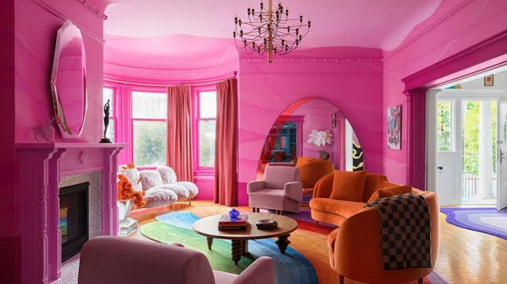
Creating a harmonious home starts with understanding how colors work together and how they impact your emotions. With the right approach, you can use color to transform your living space into a peaceful and cohesive environment.
Why Color Matters in a Home
Colors influence perception and emotion. When used intentionally, they help set the tone of a room and guide how you experience the space.
A thoughtful color scheme can:
- Create a sense of calm
- Make rooms feel larger or smaller
- Improve focus and relaxation
- Enhance comfort and warmth
- Unify different areas of the home
Harmony in design often begins with color consistency.
1. Start With a Neutral Base
Neutral colors are the foundation of a peaceful home. They create a clean and calming backdrop that allows other elements to stand out without overwhelming the space.
Popular neutral tones include:
- White
- Beige
- Cream
- Light gray
- Soft taupe
These shades work well in any room and create a timeless, balanced look.
2. Use a Limited Color Palette
Too many colors can make a space feel chaotic. Instead, stick to a simple palette of 2–4 main colors.
A balanced palette usually includes:
- One base color (neutral)
- One or two secondary colors
- One accent color
This approach creates visual harmony and keeps your home cohesive.
3. Choose Colors That Reflect Nature
Nature-inspired colors are naturally calming and easy on the eyes.
Examples include:
- Sage green
- Olive green
- Sky blue
- Earth brown
- Sand
- Soft terracotta
These colors create a grounded and peaceful atmosphere.
4. Understand Warm vs Cool Colors
Warm and cool colors affect mood differently:
Warm colors (beige, soft orange, warm white):
- Create coziness
- Feel welcoming and intimate
- Work well in living rooms and bedrooms
Cool colors (blue, green, gray):
- Promote calmness and relaxation
- Work well in bedrooms and bathrooms
- Help create a fresh, airy feel
Balancing both can create a well-rounded home atmosphere.
5. Use Color to Define Spaces
Color can help organize your home visually, especially in open layouts.
For example:
- Soft tones in living areas for relaxation
- Neutral tones in kitchens for cleanliness
- Calming blues or greens in bedrooms for rest
- Slightly darker tones in workspaces for focus
This creates natural flow and separation between areas.
6. Keep Walls Simple and Balanced
Walls take up the largest visual space in your home, so their color has a big impact.
To maintain harmony:
- Avoid overly bright or bold wall colors in large areas
- Use soft, muted tones for a calming effect
- Keep accent walls minimal and intentional
- Ensure wall colors complement furniture and décor
Simplicity on walls helps everything else feel more balanced.
7. Add Accent Colors Carefully
Accent colors add personality, but they should be used with restraint.
Good accent choices include:
- Deep green
- Navy blue
- Mustard yellow
- Soft blush
- Burnt orange
Use them in small elements such as:
- Cushions
- Artwork
- Rugs
- Decorative objects
This keeps the overall look calm while adding interest.
8. Coordinate Colors Across Rooms
A harmonious home feels connected from room to room.
To achieve this:
- Repeat similar tones throughout different spaces
- Use variations of the same color family
- Maintain consistent flooring or trim colors
- Ensure transitions between rooms feel smooth
This creates a sense of flow and unity.
9. Balance Light and Dark Shades
Contrast adds depth, but too much contrast can feel harsh.
To maintain balance:
- Pair light walls with slightly darker furniture
- Use dark accents sparingly
- Keep overall brightness consistent
A balanced mix creates visual stability.
10. Consider Natural Light
Lighting affects how colors appear.
For example:
- Natural light makes colors appear brighter and softer
- Artificial light can make colors look warmer or cooler depending on the bulb
Always test paint samples in different lighting before making a final decision.
11. Use Texture to Support Color
Color works best when combined with texture.
For example:
- Linen adds softness to neutral tones
- Wood adds warmth to cool colors
- Wool and cotton create cozy contrast
Texture prevents flat or dull-looking spaces.
12. Avoid Overusing Bright Colors
Bright colors can energize a space, but too much can feel overwhelming.
Instead:
- Use bright colors as accents only
- Balance them with neutral backgrounds
- Limit strong colors to one focal point per room
This keeps the environment calm and controlled.
13. Create Emotional Balance Through Color
Different colors affect emotions in different ways:
- Blue: calm and peaceful
- Green: balanced and refreshing
- Beige: warm and grounding
- Gray: neutral and stable
- Soft pink: gentle and comforting
Choose colors based on how you want each room to feel.
14. Keep It Consistent but Flexible
A harmonious home doesn’t mean everything must match perfectly.
Instead:
- Stick to a unified palette
- Allow small variations between rooms
- Adjust tones slightly based on lighting and function
Consistency with flexibility creates natural harmony.
Final Thoughts
Color is one of the simplest and most effective ways to create a harmonious home. When used thoughtfully, it can transform your space into a calm, balanced, and inviting environment. By choosing a limited palette, focusing on natural tones, and coordinating colors across your home, you can create a sense of unity that supports both comfort and well-being.
Start small—repaint a wall, adjust your décor accents, or simplify your color scheme. Over time, these changes will help you build a home that feels visually peaceful and emotionally balanced.