

Color is one of the most powerful elements of interior design. It has the ability to influence mood, create visual balance, and make a home feel more welcoming. Whether you’re decorating a new house or refreshing your current space, thoughtful color choices can transform every room into a place of comfort and harmony. The good news is that you don’t need to be a professional designer to achieve beautiful results. By following a few simple color design tips, you can create a home that feels stylish, peaceful, and connected.
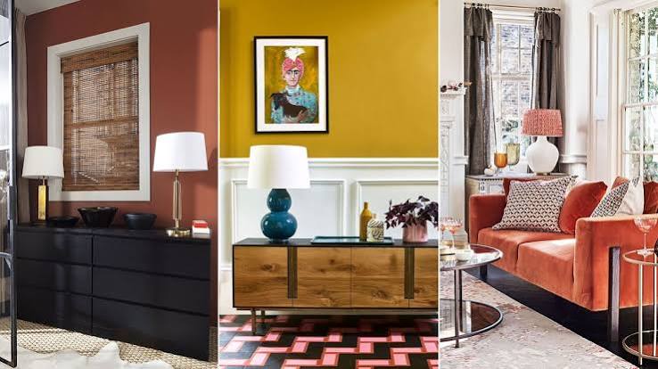
Start with a Neutral Foundation
Neutral colors provide a timeless base that works with almost any decorating style. Shades like white, cream, beige, light gray, and soft taupe make rooms feel open, bright, and versatile. These colors also allow you to easily update your décor over time by changing accent pieces rather than repainting entire rooms.
Choose a Consistent Color Palette
A harmonious home doesn’t require every room to be painted the same color. Instead, select a palette of three to five complementary colors that flow naturally from one space to another. This creates visual continuity and makes your home feel more cohesive.
For example, combine warm white, soft gray, sage green, and natural wood tones throughout your living spaces while varying the balance of each color from room to room.
Use the 60-30-10 Rule
One of the easiest decorating guidelines is the 60-30-10 rule:
- 60% of the room should feature the dominant color, usually the walls.
- 30% should include a secondary color, such as furniture, rugs, or curtains.
- 10% should be an accent color used in pillows, artwork, lamps, or decorative accessories.
This approach creates a balanced look without making the room feel cluttered or overwhelming.
Consider the Mood of Each Room
Different colors create different emotions, so choose shades that match the purpose of each space.
- Living Room: Warm neutrals, soft greens, and light blues create a welcoming atmosphere.
- Bedroom: Gentle blues, lavender, sage green, and warm gray encourage relaxation.
- Kitchen: White, cream, pale green, and light gray create a fresh and clean appearance.
- Home Office: Soft blue and green help improve focus while maintaining a calm environment.
Selecting colors based on function helps every room feel more comfortable.
Balance Warm and Cool Colors
Warm colors like beige, terracotta, mustard, and soft brown create comfort and coziness. Cool colors such as blue, green, and gray promote calmness and relaxation.
Combining both warm and cool tones adds depth and prevents a room from feeling too cold or overly intense. For example, pair cool gray walls with warm wooden furniture and natural woven accessories.
Let Natural Light Guide Your Choices
Lighting greatly affects how paint colors appear. Rooms with abundant sunlight can handle cooler shades, while darker spaces often benefit from warm colors that brighten the environment.
Before painting an entire room, test several color samples on different walls and observe them at various times of the day.
Add Color Through Accessories
If you’re hesitant to paint bold walls, introduce color through decorative accents instead. Throw pillows, blankets, rugs, artwork, plants, and curtains are easy ways to add personality without making a permanent commitment.
This approach also allows you to refresh your home’s look seasonally with minimal effort.
Use Natural Colors for Timeless Appeal
Nature offers endless inspiration for harmonious interiors. Earthy greens, sandy beige, sky blue, warm browns, and soft stone grays create a peaceful atmosphere that never goes out of style. These colors pair beautifully with wood, stone, linen, and other natural materials.
Avoid Using Too Many Bold Colors
While vibrant colors can make a statement, using too many at once may create visual clutter. Limit bold shades to one or two accent colors and balance them with neutral backgrounds to maintain a calm, inviting environment.
Final Thoughts
Creating a harmonious home with color doesn’t have to be complicated. By choosing a consistent palette, balancing warm and cool tones, considering natural light, and using accent colors thoughtfully, you can design spaces that feel comfortable and visually connected. Small, intentional color choices can have a lasting impact, helping your home become a place where every room feels balanced, welcoming, and uniquely yours.