

Choosing the right color palette for your home is one of the most effective ways to create a comfortable, beautiful, and harmonious living space. Colors influence how a room feels, affect mood, and can even change the perception of size and light. By selecting colors that suit each room’s purpose, you can create a home that feels both functional and welcoming.
Start with Your Home’s Overall Style
Before selecting colors for individual rooms, consider the overall design of your home. Whether your style is modern, traditional, farmhouse, Scandinavian, or minimalist, your color choices should create a sense of continuity. You don’t need to use the same color everywhere, but the palettes should complement one another to create a cohesive flow.
Neutral colors such as white, beige, gray, and soft taupe provide a versatile foundation that works well with almost any decorating style. Accent colors can then be added through furniture, artwork, rugs, and decorative accessories.
Living Room
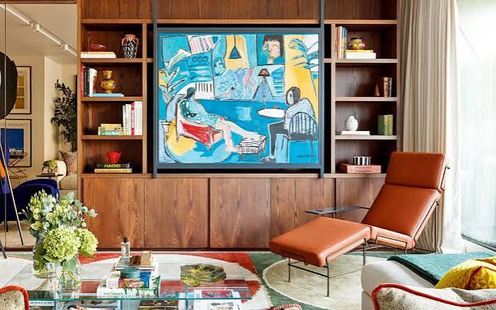
The living room is often the heart of the home, making it an ideal place for warm and inviting colors. Soft beige, warm gray, sage green, light blue, and creamy white are popular choices because they create a relaxing atmosphere.
If you want more personality, introduce accent colors like navy blue, mustard yellow, terracotta, or forest green through cushions, curtains, or decorative pieces without overwhelming the space.
Kitchen
The kitchen benefits from colors that feel clean, bright, and energetic. White remains a timeless option because it reflects light and creates a fresh appearance. Soft gray, pale green, muted blue, and warm cream also work beautifully.
Wood cabinets pair well with earthy tones, while modern kitchens often feature black, charcoal, or navy accents for a sophisticated look.
Dining Room
Dining rooms are ideal for colors that encourage conversation and comfort. Warm neutrals, muted greens, soft blues, and elegant earth tones create a welcoming environment for family meals and gatherings.
Adding darker accent walls or rich wood finishes can also bring depth and character to the space.
Bedroom
Bedrooms should promote relaxation and restful sleep. Soft blue, lavender, sage green, dusty rose, warm gray, and gentle beige are excellent choices because they create a calming atmosphere.
Avoid overly bright or highly saturated colors throughout the room. Instead, use vibrant shades as accents in pillows, artwork, or decorative accessories.
Bathroom
Bathrooms often feel larger and cleaner with light colors. White, soft blue, pale gray, aqua, and light green create a spa-like atmosphere that promotes relaxation.
Natural materials such as wood, stone, and woven baskets complement these colors and add warmth to the space.
Home Office
A productive workspace benefits from colors that improve focus without becoming distracting. Soft greens and blues encourage concentration, while neutral shades keep the room feeling organized.
If you need extra energy, incorporate small accents of yellow or orange through office décor rather than painting entire walls.
Children’s Room
Children’s rooms should balance creativity with comfort. Soft pastel colors work well for younger children, while older kids often enjoy brighter accent colors paired with neutral walls.
Choosing timeless base colors makes it easier to update the room as children grow by simply changing bedding, artwork, and accessories.
Consider Natural Light
Lighting has a significant impact on how paint colors appear. Rooms with plenty of natural sunlight often handle cooler shades well, while darker rooms usually benefit from warm colors that make the space feel brighter.
Always test paint samples on different walls and observe them throughout the day before making a final decision.
Follow the 60-30-10 Rule
A helpful decorating guideline is the 60-30-10 rule:
- 60% of the room uses the dominant color (typically walls).
- 30% is the secondary color (furniture and larger décor).
- 10% consists of accent colors (pillows, artwork, lamps, and accessories).
This balance creates visual harmony without making the room feel overwhelming.
Final Thoughts
Choosing the perfect color palette for every room doesn’t require following every trend. Instead, focus on colors that match your home’s style, support each room’s purpose, and reflect your personal taste. By combining thoughtful color choices with good lighting and balanced accents, you can create a harmonious home that feels welcoming, comfortable, and timeless for years to come.