

The living room is where families gather, friends connect, and quiet moments are enjoyed after a busy day. Choosing the right color palette can make this space feel warm, inviting, and peaceful. Relaxing colors help reduce visual stress, improve comfort, and create a welcoming atmosphere that everyone can enjoy. Whether you’re planning a complete makeover or simply refreshing your décor, these living room color ideas can help you create a calm and harmonious home.
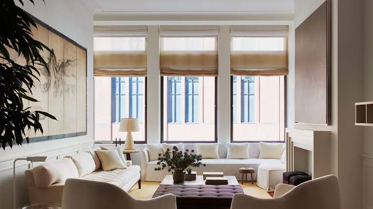
Choose Soft Neutral Colors
Neutral colors are a timeless choice for a relaxing living room. Shades such as warm white, cream, beige, light gray, and taupe create a bright and airy environment without feeling overwhelming. These colors also provide a versatile backdrop for furniture, artwork, and decorative accessories.
Pair neutral walls with natural wood furniture, woven baskets, and soft fabrics to add warmth and texture.
Create Calm with Soft Blue
Blue is widely known for its calming effect. Light blue, powder blue, and dusty blue can make a living room feel peaceful and refreshing. These shades are ideal for homes that receive plenty of natural light, creating an open and serene atmosphere.
Complement blue walls with white trim, light-colored furniture, and soft gray accents for a balanced look.
Bring Nature Indoors with Sage Green
Sage green has become one of the most popular interior colors because it brings the calming influence of nature inside. It works beautifully with neutral furniture, wooden accents, and indoor plants, creating a space that feels fresh and relaxing.
This versatile color suits both modern and traditional living room designs.
Add Warmth with Earth Tones
Earth-inspired colors such as terracotta, sand, clay, and warm brown create a cozy and welcoming environment. These shades make large living rooms feel more intimate while adding depth and character.
Use earth tones through accent walls, decorative pillows, rugs, or artwork to avoid making the room feel too dark.
Light Gray for Modern Comfort
Soft gray is a sophisticated neutral that creates a clean and relaxing atmosphere. It pairs well with nearly every color, making it easy to update your décor over time.
Add warmth by incorporating wooden furniture, textured blankets, and soft lighting to prevent gray from feeling too cool.
Cream and Ivory for Timeless Elegance
Cream and ivory offer a softer alternative to bright white. These colors reflect natural light while creating a warm, welcoming atmosphere that never goes out of style.
Layer different shades of cream with beige, tan, and natural materials for a comfortable, elegant appearance.
Use Accent Colors Thoughtfully
While the main color palette should remain calm, carefully chosen accent colors can add personality without disrupting the relaxing atmosphere.
Popular accent colors include:
- Navy blue
- Olive green
- Muted mustard
- Dusty rose
- Charcoal gray
- Deep forest green
Use these colors in throw pillows, artwork, curtains, decorative vases, or area rugs rather than painting entire walls.
Consider Natural Light
Natural light greatly influences how colors appear throughout the day. Rooms with large windows can comfortably use cooler shades like blue or gray, while darker living rooms often benefit from warmer tones such as cream, beige, or soft taupe.
Always test paint samples on several walls before making your final decision.
Add Texture for Extra Warmth
A relaxing living room isn’t created by color alone. Texture plays an important role in making a space feel inviting.
Combine your color palette with:
- Soft area rugs
- Linen or cotton curtains
- Knit blankets
- Wooden furniture
- Woven baskets
- Indoor plants
- Natural stone or ceramic décor
These elements add depth while maintaining a peaceful, harmonious style.
Keep the Color Palette Simple
Too many competing colors can make a room feel busy and distracting. A palette of three to five complementary shades usually creates the most balanced look.
A helpful approach is the 60-30-10 rule:
- 60% dominant color (walls)
- 30% secondary color (furniture)
- 10% accent color (accessories)
This guideline keeps the room visually balanced while allowing for subtle pops of color.
Final Thoughts
The right color palette can transform your living room into a peaceful retreat where you can relax, entertain, and spend quality time with family. Soft neutrals, calming blues, gentle greens, warm earth tones, and timeless creams all help create an inviting atmosphere. By combining soothing colors with natural textures, comfortable furnishings, and thoughtful lighting, you can design a living room that feels harmonious, stylish, and welcoming throughout every season.